Objectives:
Banks face significant challenges in monitoring and managing credit risk, particularly as loans transition between different risk categories over time. Without a comprehensive analysis of loan movement, banks may struggle to identify early warning signs of default or detect trends in credit deterioration. This project aims to provide a dynamic and visual tool to track loan movement and assess credit risk more effectively, helping the bank mitigate potential losses and maintain a healthy loan portfolio.
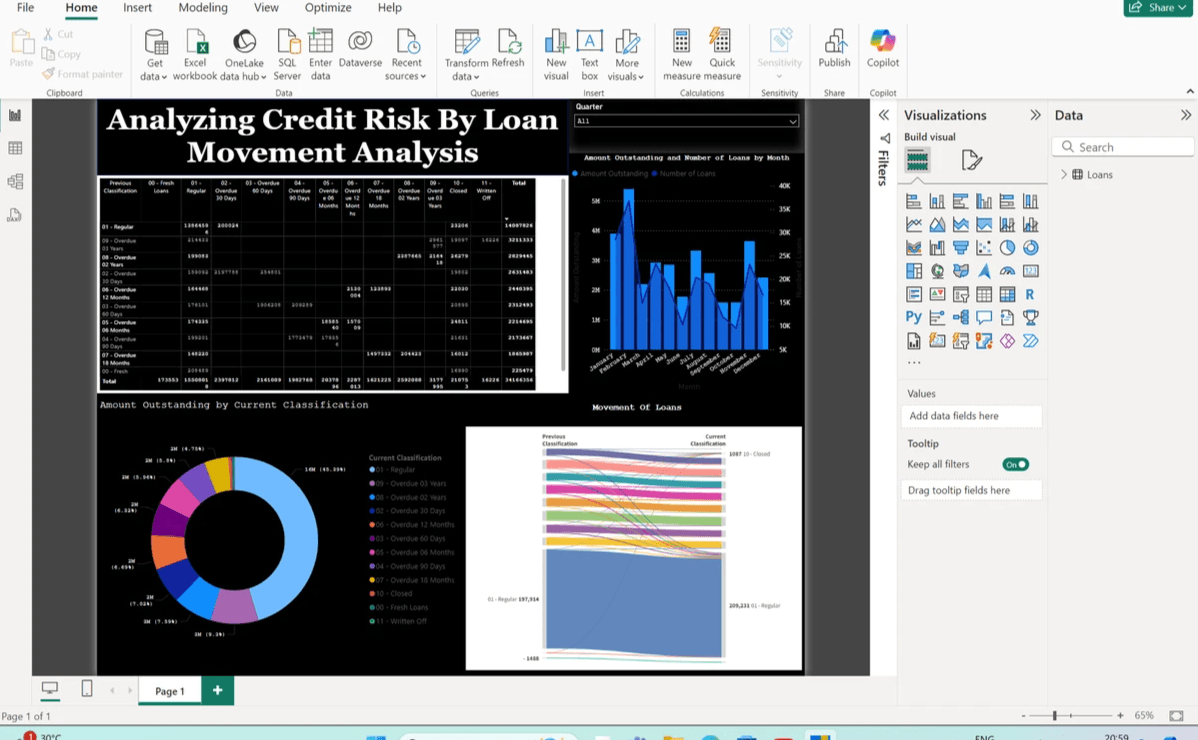
For the analysis, I have utilised a couple of visulisation to make sense of the data and spot the ongoing trends. A table, pie chart, bar graph and a line chart, and a sankey diagram are parts of the dashboard.
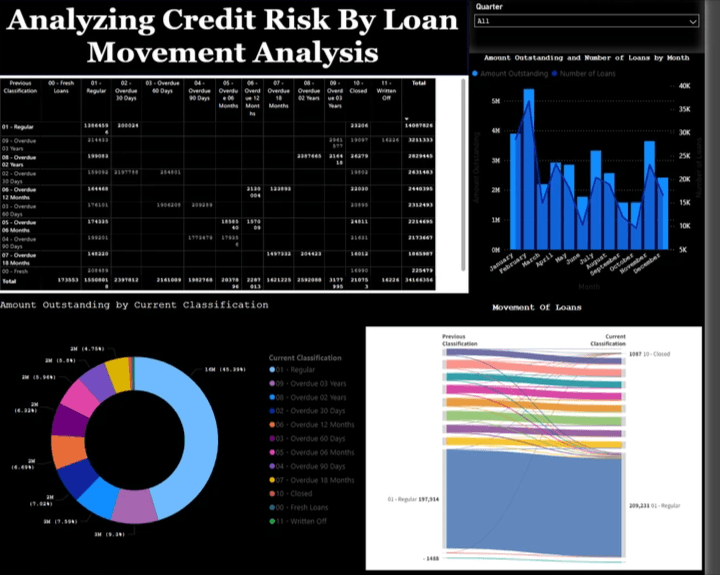
A slicer for Quarterly data

A slicer is an interactive tool in Power BI that allows users to filter data dynamically. This slicer enables targeted, time-based filtering of loan data, making it easier to conduct granular analysis and create dynamic, insightful reports that reflect how loans behave across different quarters. The slicer will allow me to narrow down loan data to a specific quarter. For instance, if I want to see loan performance or risk classification for Q1, Q2, Q3, or Q4, I can select the corresponding option in the slicer. When "All" is selected, it shows data for all quarters combined, which can be helpful for viewing the overall performance. The slicer gives flexibility in reporting, allowing stakeholders to focus on specific periods without manually modifying the underlying data.
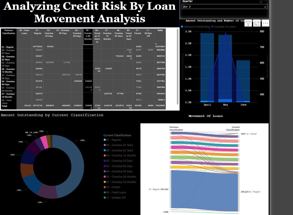
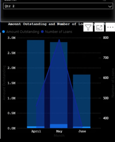
Data in second Quarter
Amount Outstanding by Current Classification: Pie Chart
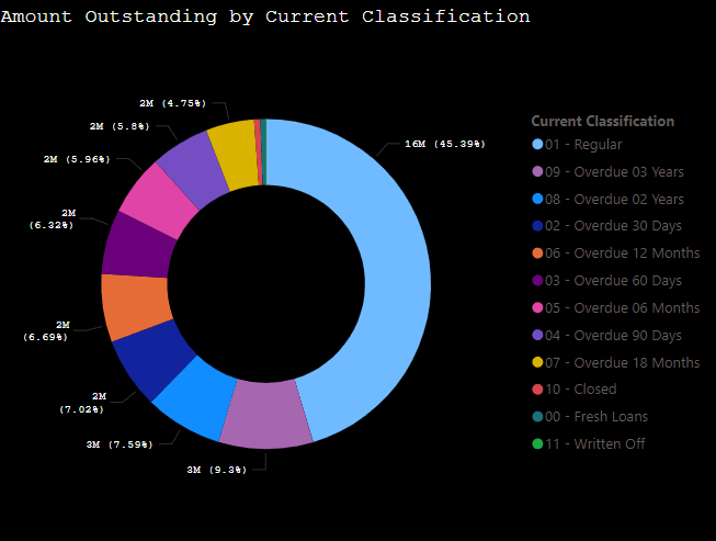
The pie chart shows amount yet to be paid back per categories.
Sankey Diagram for traking down movement of loans
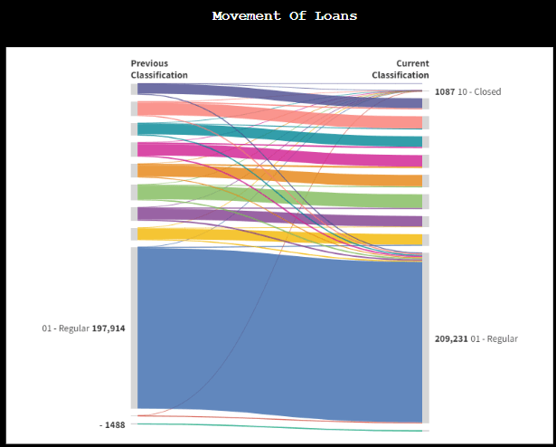
I have made use of a Sankey Chart to visualizes the flow of items between two different classifications: Previous Classification and Current Classification. Each colored band represents a group of items that have transitioned between classifications. The width of the bands is proportional to the number of items transitioning from one category to another. The chart illustrates the reclassification of a large set of items, showing how they move between categories from the previous to the current classification. Most items remained in the 01 - Regular category, with smaller transitions to other categories, including 10 - Closed.
Results
The first step involved gathering historical loan data from various sources within the bank, including loan classifications, borrower details, repayment histories, and default rates. The data was cleaned, and key metrics such as loan balances, risk ratings, and movement across risk categories were calculated. The dashboard revealed a clear trend of loan migration from low to higher risk categories during certain quarters, particularly following economic downturns.
Key Metrics:
Key metrics like default rates, loan exposure, and loan recovery rates were calculated and displayed using a variety of visuals (e.g., bar charts, line graphs, and card visuals). Metrics were also broken down by loan type (e.g., personal, corporate) and borrower risk profiles, providing a comprehensive overview of the bank’s credit risk portfolio. Default rates spiked in certain borrower segments, indicating potential areas of concern for credit risk management.
Visualisations:
A key visual used in the dashboard is a Sankey diagram, which shows the flow of loans between classifications over time, helping to identify trends and patterns in credit risk movement. The Sankey diagram showed that a majority of loans in the regular category remained stable, but some moved into higher risk classifications, warranting further investigation. To provide flexibility in analysis, I incorporated interactive tools such as a quarterly slicer to filter loan data by specific time periods. This allows users to drill down into data for different quarters to understand seasonal trends and the timing of loan risk changes.
Analysis:
I utilized loan movement analysis to track how loans transitioned between different risk categories (e.g., from low risk to high risk, or from performing to non-performing loans). The interactive quarterly slicer allowed deeper insights into quarterly performance, making it easier to assess the timing and causes of increased credit risk. Overall, the dashboard provided a comprehensive tool for the bank to monitor, assess, and mitigate credit risk effectively. This analysis equips the bank with valuable insights to adjust lending strategies, manage risk more proactively, and strengthen loan recovery efforts.
Scan to view in Power BI
